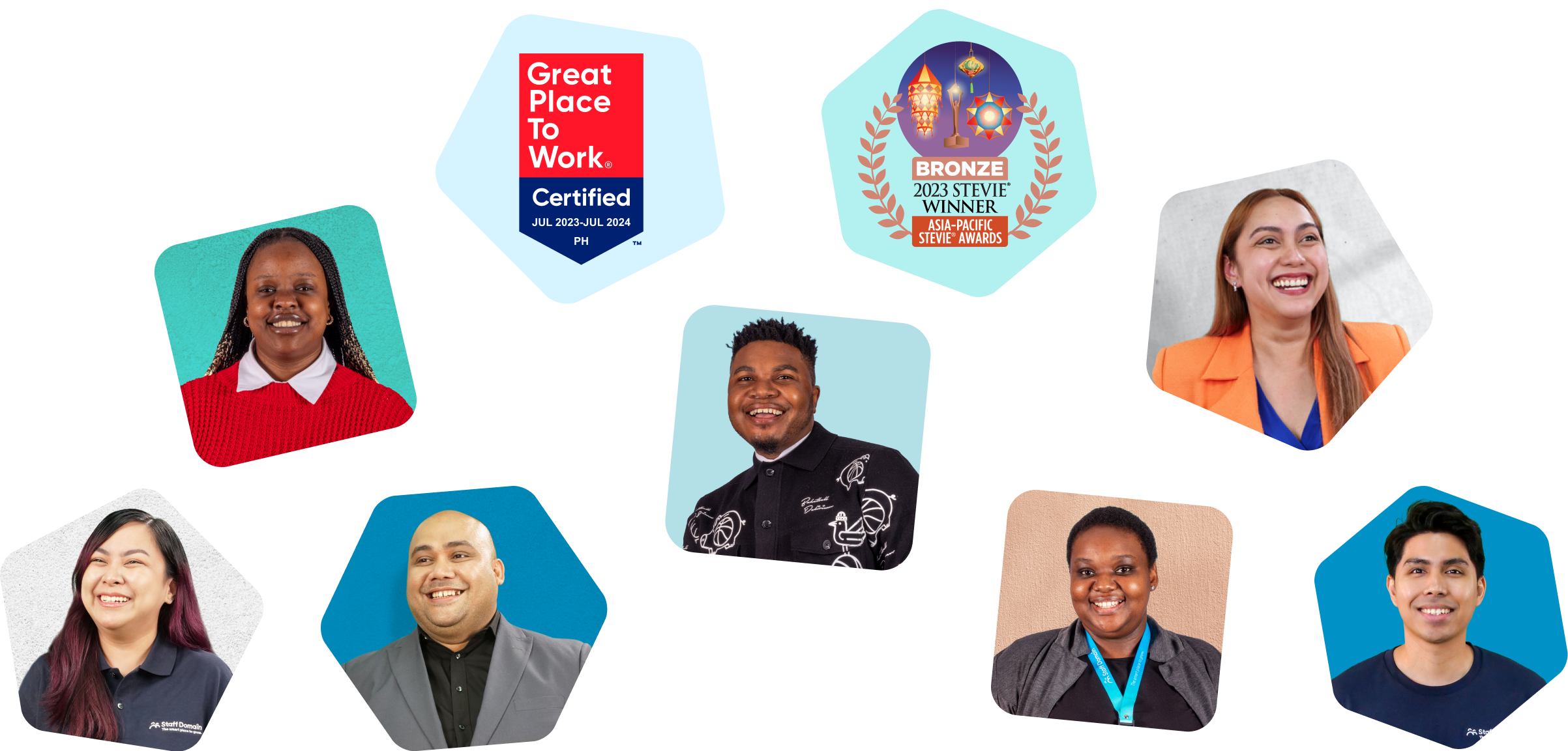
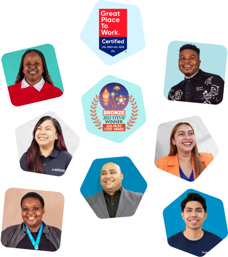
We operate in leading global markets to help you find highly qualified, experienced, English-proficient talent. Unsure what to expect? Meet some of the outstanding staff working alongside our team and clients
SA and US Experience. Develop, implement, and lead marketing activities, generation and execution of marketing plans and automation. Bachelor of Arts in Media Studies and International Relations.
Staff Domain is proud to be a trusted offshore outsourcing partner to businesses worldwide
Gold standard customer care thanks to offshore support
“The idea was that through a blend of offshore and onshore staff we would be able to increase our capacity and have more time for clients. Staff Domain have helped us a build a high-performing team of 3 recruiters in the Philippines to take on candidate-focused work. They’re smashing their KPIs and have helped our local team find more time for client servicing.”
Unlocking 20+ hours a week with reliable, experienced global staff
“Martina is thorough, accurate and picks things up very quickly. I review all her work, but I have a lot of confidence because I don’t pick up on many errors. In fact, sometimes she can be even more detailed oriented then myself! When I give her a task, I know she’ll get it done to the best she can.”